Masonry is a JavaScript grid layout library based on columns. It works by placing elements in optimal position based on available vertical space. It doesn’t have fixed height rows.
Popular social site – Pinterest was the first major website to use this layout style.
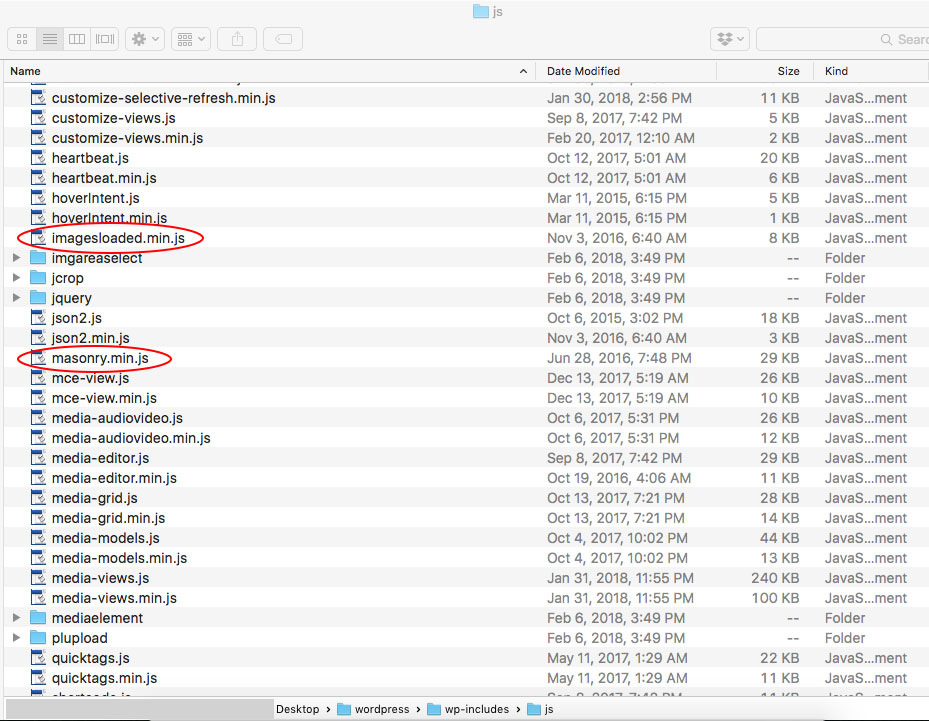
As of WordPress version 3.9, Masonry is actually built into the core of WordPress ( wp-includes/js/masonry.min.js ). This WordPress version of Masonry also includes ImagesLoaded (imagesloaded.min.js).
- When we fill a container with equally sized objects and float them left, we get a nice grid of images.
- If we are displaying multiple images and they are all different sizes, they appear scattered.
LAYOUT BEFORE APPLYING MASONRY:
LAYOUT AFTER APPLYING MASONRY:
Markup for our HTML elements
<div class="row" id="ms-container">
  <div class="grid-item">...</div>
  <div class="grid-item">...</div>
  <div class="grid-item">...</div>
</div>
We need to tell WordPress to pull Masonry out of the core install and actually use it. This is done by enqueuing it in the functions.php file of your theme.
function my_masonry() {
	wp_enqueue_script('masonry');
}
add_action('wp_enqueue_scripts', 'my_masonry');


function MasonOnLoad() { ?> 	<!-- add masonry setting to the footer -->
  <script>
	(function( $ ) {
		"use strict";
		$(function() {
    			// set the container that Masonry will be inside of in a var
    			// adjust to match your own wrapper/container class/id name
   		 	var container = document.querySelector( '#ms-container' );
    			//create empty var msnry
    			var msnry;
   		 	// initialize Masonry after all images have loaded
    			imagesLoaded( container, function() {
        			msnry = new Masonry( container, {
            		// adjust to match your own block wrapper/container class/id name
            		itemSelector: '.grid-item'
        			});
    			});
		});
	}(jQuery));
  </script>
<?php } // end function MasonOnLoad
add_action('wp_footer', 'MasonOnLoad');
UPDATED 10/28/22
Another way to add masonry
NOTE: Masonry / imagesLoaded : prevent layout refresh from moving already loaded items
function MasonOnLoad() { ?> <!-- add masonry setting to the footer -->

<script>

	(function( $ ) {
    		"use strict";
		$(function() {

    		var $grid = $('#ms-container');
    		// init Masonry
    			$grid.masonry({
        		// options
        			itemSelector: '.grid-item'
    			});

    //Here I attach the new loaded items (html var) in the #ms-container div.
    $grid.append(html).each(function(){
        $grid.masonry('reloadItems');
    });

    $grid.imagesLoaded(function(){
        $grid.masonry();
    });
});
}(jQuery));

</script>

<?php } // end function MasonOnLoad
add_action('wp_footer', 'MasonOnLoad');
As long as we have a width set on our container div, the code above performs the magic we need it to and reflows the elements. If you set the div width to a percent, Masonry automatically reflows the items as the page resizes and maintains their aspect ratio.

Thanks, works perfect (also with Divi).
This went in great… I’m experienceing a problem with the re-sizing of the browser window. the columns aren’t resetting until refresh… I was wondering if you had run into this before?
Hi Luigi,
Thank you for your comment. I updated the code and now the columns should reset while resizing the browser window. The original code had the isFitWidth: true option, which actually does not work with element sizing with percentage width. It would work with fixed columnWidth: 400 selector (for example). Good catch!
Have a good day!
Works Perfect… Thanks For the Quick Response!!!!
You’re welcome. I am glad it works 🙂
Great, and thanks for sharing and appreciate you.
WordPress Support-Wpfix.shop
Thank you very much for your tutorial! I have implemented it for displaying a standard WordPress image gallery in masonry mode and it works perfectly for a single gallery on a page.
If I add more galleries to a page it works only for the first gallery, though.
Each gallery uses the same class for the container (“.gallery”) and the masonry block (“.masonry-grid-item”).
Do you have any idea how to make it work for more than one gallery on a single page?
Should I include the above code multiple times to use individual container names for each gallery?
Thanks!
With document.querySelector(‘.gallery’) you only get the first html element that has the print-slider class. That’s why only the first masonry is initialized.
Below is your code adjusted in order to catch all .gallery elements and init the masonries respectively. This way we get the elements by class name and then loop through them.
var container = document.querySelector( ‘.gallery’ );
imagesLoaded( container, function() {
var n = container.length;
for(var i = 0; i < n; i++){
msnry = new Masonry( container[i], {
itemSelector: ‘.masonry-grid-item’,
isFitWidth: true
});
}
});
I have tried to set the container in Masonry but nothing worked and it broke my site in places without that the code being complete. It worked on the Blog page that I was making it for but my home page broke. Would you be able to point me in the direction of how you set the column width?
Can you give me the URL of your website so I could look at the code?